Different events mean different booth sizes, hall layouts, and marketing goals. In practice, a brand may need a functional 20 m² booth for one event and, at another, an 80 m² exhibit that accommodates several zones and increases conversation capacity. The key question is: how do you keep a consistent brand image and the same visual language while adapting the booth build to radically different floor spaces? The answer is Clever Frame trade show booths, designed with scaling and repeatable configurations in mind.
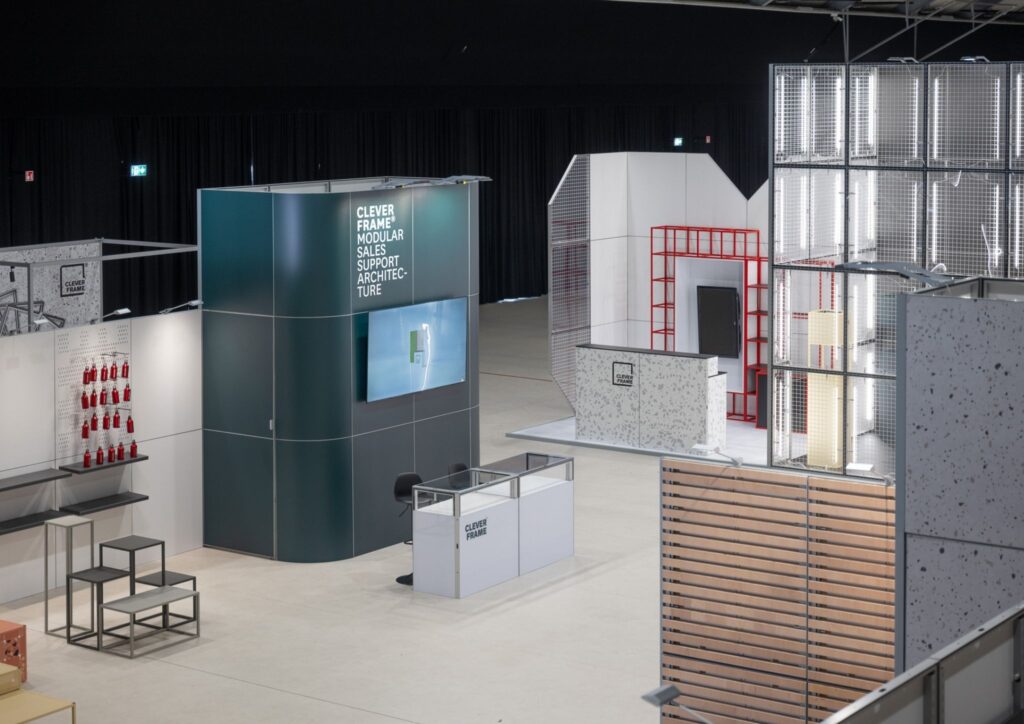
Floor space flexibility means that one booth can perform effectively across different footprints while maintaining brand recognition, functionality, and display quality. It’s not just about making the booth bigger, but about creating a layout that meets event goals in its smaller version and allows zones and visitor touchpoints to expand in its larger version.
Scaling should apply to both communication and ergonomics. In practice, what changes most are layout elements and the number of zones, not the visual identity itself.
If a design must work on both 20 m² and 80 m², it is worth building it around the brand core, meaning repeatable recognition elements. Then layout variants can be selected depending on the footprint and the purpose of attendance.
Fixed elements help maintain consistency between events and build recognition over time. They are what make the booth feel like the same brand even when the footprint changes.
A scalable design isn’t about making a bigger version of the same booth. It’s about a consistent recognition architecture and layout variants that preserve the same brand character while changing capacity and functions – emphasises Maciej Czarnecki, Design Director.
The 20 m² and 80 m² versions can use the same elements, but in different quantities and arrangements. This increases flexibility and means the brand does not have to start from scratch with every execution.
Across different footprints, the biggest changes are traffic strategy and the way conversations are handled. In a smaller space, clarity and maximum readability matter most. In a larger space, functions can be separated more deliberately to improve comfort and increase the number of high-quality interactions.
On 20 m², the booth needs to work as a condensed version of the brand story. Usually, the most effective layout allows quick entry, a short conversation, and an easy exit without creating bottlenecks in the traffic flow.
On 80 m², it is worth designing for different interaction rhythms: from quick contact, through substantive discussions, to presentations for small groups. The larger footprint makes it possible to separate functions, which usually improves comfort and meeting quality.
Events differ in topic, seasonality, and audience. That is why it is important for the same booth build to quickly gain a new communication context. In Clever Frame trade show booths, an important role is played by a solution based on interchangeable panels.
Solutions based on interchangeable graphic panels make it possible to replace them quickly, so communication can be updated depending on seasonal campaigns or changing marketing needs. Changing the narrative does not require rebuilding the entire booth build – the brand can maintain a consistent booth skeleton while modifying only the communication layer.
Floor space flexibility does not end with the design. In practice, transport, storage, and the pace of pre-event preparations also matter. A modular booth build that can be arranged in different configurations makes event calendar planning easier and eliminates the number of elements created for one-off use.
For frequent trade show participation, repeatability of the process and predictability for the event team are especially important.
A booth is a marketing tool that works for brand visibility, the quality of conversations, and the visitor experience. On a small footprint, it primarily strengthens brand recognition and communication speed. On a larger footprint, it makes it possible to build a more complex experience and run several processes in parallel.
It is worth treating floor space as a resource that is managed depending on priorities: lead generation, relationships, portfolio presentation, and market education.
From a sustainability perspective, what matters most is the ability to reuse booth elements multiple times and update communication without producing entirely new solutions. A modular approach helps reduce one-off builds designed only for one footprint and one event.
In practice, this translates into greater control over the life cycle of display elements and fewer start-from-zero activities whenever the communication concept changes.
Floor space flexibility improves event budget efficiency especially when a brand regularly takes part in several events per year with different space requirements. Instead of designing separate booth builds, one concept can be developed and the configuration adapted to the conditions.
Most benefits appear in operational and planning areas.
A scalable concept often works well in formats other than traditional trade fairs. When the layout can be modified, it becomes easier to adapt the display to the venue and event goals without sacrificing presentation quality.
This approach also allows exhibition elements to be used at industry events, roadshows, in showrooms, and in partner zones at conferences – wherever consistent branding and an organised space matter.
A scalable design is built on a consistent brand core and flexible configurations that respond to the event objective and visitor flow. The best approach is one where the booth architecture is repeatable and the communication can be updated depending on the campaign.
If events with very different footprints are planned, it is worth starting by defining the communication core and preparing two or three configurations that can be repeated season after season. Examples of how to scale layouts and swap graphics can be found in projects featured at https://cleverframe.com/ – a solid reference point for planning a consistent standard for your event presence.