
Trade show booths should do more than attract attention. Above all, they should support a brand’s marketing and sales objectives. However, mistakes made during the design stage can reduce the visibility of the display, make it more difficult for the team to work effectively and limit the number of valuable leads generated. Discover what to consider when creating a functional and effective trade show space.
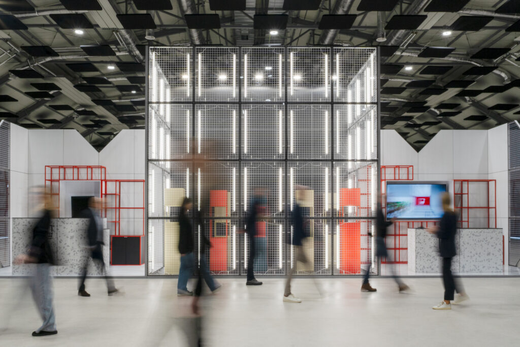
A trade show booth is not simply an attractive space featuring a company logo. It is a tool for communication, sales and relationship building that should support a specific business objective. Even a visually impressive design may fail to deliver the expected results if it does not take into account visitor flow, the way the team works, how the offer is presented or how leads are collected.
Most problems do not begin during installation. They stem from decisions made much earlier — when preparing the brief, choosing the booth layout and establishing communication priorities. Which mistakes should be avoided?
One of the most common mistakes is starting the process by selecting colours, materials and structural forms. The first question should instead be: what does the company want to achieve at the trade show?
A booth designed to generate leads will require a different approach from a space intended for meetings with key clients or the launch of a new product. The objective influences almost every design decision — from the functional layout and the number of customer service stations to the way content is presented.
If business meetings are the priority, the booth should include a comfortable and partially enclosed meeting area. If the brand plans to conduct demonstrations, a clearly visible presentation area should become the focal point. For lead-generation activities, an open layout, efficient visitor flow and easy access to the team will be essential.
Without a clearly defined objective, the booth may look attractive but fail to support the company’s trade show goals effectively.
Marketers often want to use every available surface to present products, services, competitive advantages, certificates, the company’s history and current promotions. The result is visual overload, with no single message standing out clearly enough.
Visitors move quickly through exhibition halls. They have only a few seconds to notice a booth, recognise the brand and understand what the exhibitor offers. This is why the communication hierarchy should be clearly defined:
More detailed information can be provided during a conversation or product presentation, displayed on a screen or made available after scanning a QR code. Booth graphics should initiate contact rather than attempt to replace the entire sales process.
An unusual structure may attract attention, but it should not make the booth more difficult to use. Architectural features can sometimes restrict access, obscure products or occupy a large proportion of the available floor space without providing any practical value.
The design should be assessed not only on the basis of its visualisation, but also from the perspective of everyday use:
A well-designed booth combines visual appeal with ergonomics. Its form should organise the space and support the activities planned for the event, rather than becoming an end in itself.
The same design will not work equally well in every part of an exhibition hall. Corner booths, island booths and inline booths offer different possibilities for opening the space to visitor traffic. Main aisles, neighbouring displays and the direction from which most attendees approach the booth must also be considered.
Designing a booth without an up-to-date floor plan or without accounting for neighbouring structures is a mistake. A tall wall placed on the wrong side can reduce visibility, while a counter positioned at the main entrance can create an unnecessary barrier.
Potential sightlines and visitor touchpoints should be analysed during the concept stage. Key brand elements should be clearly visible both from close range and from a distance.
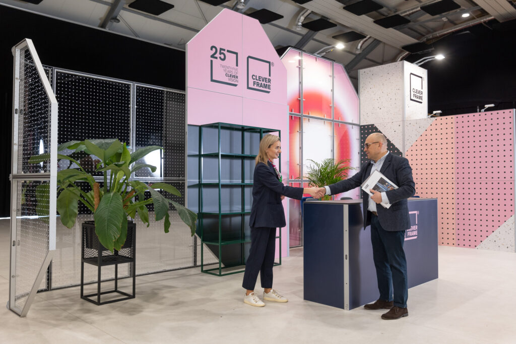
Enclosed structures, tall counters positioned along the edge of the booth, narrow passageways or team members standing with their backs to the aisle can significantly reduce the number of visitors. Even an attractive display will fail to fulfil its purpose if entering the booth requires visitors to cross an obvious physical or psychological barrier.
An open layout does not mean abandoning clearly defined zones. The initial contact point, product display, demonstration space and meeting area can all be separated while maintaining a natural flow of people.
Visitors should intuitively understand where they can enter, what is worth seeing and whom they should approach.
Lighting is often treated as a technical detail to be selected towards the end of the design process. In reality, it directly affects how colours, graphics, products and the space as a whole are perceived.
The general lighting in an exhibition hall is usually insufficient. It tends to be flat and unappealing and does not allow attention to be directed towards the most important elements. On the other hand, luminaires that are too powerful or poorly positioned can dazzle visitors, create reflections on screens or distort the appearance of displayed products.
A good lighting design should incorporate several layers: general, accent and task lighting. Products with glossy surfaces, display cases, transparent materials, screens and areas intended for photography require particular attention.
Booths usually look perfect in visualisations — free from packaging, coats, documents, cables, spare materials and the team’s personal belongings. During an event, however, all of these items need to go somewhere.
A lack of planned storage space quickly leads to clutter. Boxes end up under tables, bags are left in meeting areas and promotional materials occupy surfaces intended for product displays.
Even a small booth should include lockable cabinets or a compact storage area. Access to power, device storage, replenishment of materials and space for drinks and personal belongings should also be considered. Keeping the booth organised affects not only its appearance but also the team’s comfort and efficiency.
A booth is often assessed as a static image, while in practice it operates for many hours and is used by several people at the same time. Too few places for conversations, insufficient demonstration space or overlapping zones can make it difficult for even a well-prepared team to work effectively.
The designer should know how many people will be working at the booth, what tasks they will perform and how many visitors may be present at the same time. It is also worth providing space for brief conversations, as well as a separate area for meetings that require greater focus and privacy.
Accessibility is equally important. Passageways, counter heights and the way materials are presented should allow people with limited mobility to use the booth comfortably.
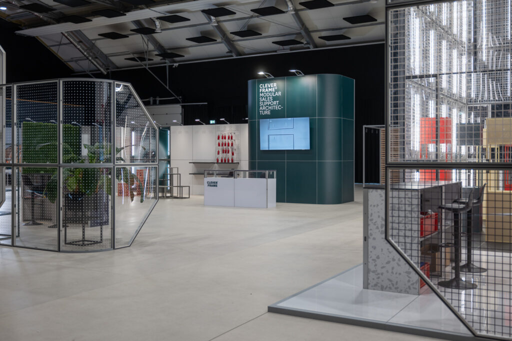
Screens, LED walls, applications and interactive presentations can enhance the visitor experience — but only when they help achieve a specific objective. A screen playing a generic corporate video on a loop rarely holds anyone’s attention for long.
Technology should make it easier to present the product, demonstrate information that would be difficult to show physically, support personalised conversations or enable the collection of contact details. Its practical operation must also be considered, including a stable internet connection, access to power, appropriate screen positioning, offline copies of content and a designated person responsible for the equipment.
Technology is effective when it forms part of a carefully planned visitor journey rather than serving merely as decoration.
Designing a booth for only one specific floor area may mean having to build an entirely new structure for the next trade show. This increases costs, complicates logistics and makes it more difficult to maintain a consistent brand image.
At the initial design stage, it is worth checking whether the structure can be adapted to different booth sizes, locations and objectives. Modular solutions make it possible to change the layout, expand the structure, replace selected graphics and reuse the equipment. Examples of ready-made modular trade show booths can be found in the Clever Frame project finder.
This does not mean that every booth has to look the same. A well-planned system makes it possible to create a variety of configurations using the same base, while maintaining brand recognition and reducing the production of single-use components.
Some concepts look impressive on screen but prove difficult or expensive to implement. Problems may involve transportation, installation time, permitted structure heights, suspended elements, power supply, fire safety requirements or deadlines for submitting the design to the organiser.
This is why the event’s technical regulations should be reviewed before the concept is approved. The booth dimensions are not the only relevant factor. Installation schedules, access to the exhibition hall, load limits, required certificates and regulations concerning neighbouring booths must also be verified.
It is also important to assess the total cost of implementation, including transportation, technical support, installation, storage and potential disposal. The least expensive structure does not always result in the lowest overall cost of participating in an event.
A booth should not only attract attention but also support the achievement and measurement of specific objectives. If the company’s priority is lead generation, the design must include appropriate places and tools for recording contact details efficiently. If the objective is a product launch, the space should make it possible to measure participation in presentations or interest in particular solutions.
Before the event, the company should decide what data will be collected, who will be responsible for it and how the information will be transferred to the CRM. A QR code alone will not solve the problem if it leads to an irrelevant page and the team has no consistent method for qualifying conversations.
The spatial design, visitor service process and sales workflow should operate as one integrated system. Only then can the company accurately assess whether the booth is fulfilling its purpose.
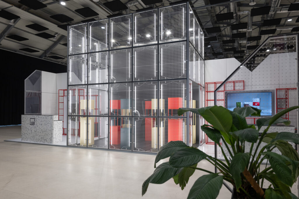
A successful design begins with strategy, not a visualisation. It should take into account the purpose of participating in the event, visitors’ needs, the way the team works, the booth’s location within the hall, logistics and the future use of individual components.
Before approving a concept, it is worth asking several fundamental questions:
The best booths do not have to be the most elaborate or spectacular. Their greatest strength is consistency: every element has a specific purpose, the communication is clear and the space is designed around real visitor behaviour and the exhibitor’s business objectives.